C.A.L.M VIDEOS
"Being Silent ain't being strong" ad campaign for C.A.L.M (campaign against living miserably)
Friday, 12 October 2007
Wednesday, 27 June 2007
27/06/07
UNDERSTANDING COMICS
Scott McCloud
I have recently finished reading this, and although it's not a graphic design book I have still picked up on a nimber of things that I found useful
Definition of Comics
p.9 "JUXTAPOSED PICTORAL AND OTHER IMAGES IN DELIBERATE SEQUENCE"
This gives comics a very wide scope. Some things McCloud suggests could be classed as comics are instruction diagrams, hyroglyphics, paintings or photos intended to be viewed in sequence, stained glass windows in churches and cave paintings.
Character design
In chapter 2 McCloud talks about iconography and cartooning.
If we look at a realistic image of a face, we see it as the face of someone else. If on the other hand we look at a simple cartoon drawing of a face, we see ourselves in it. He explains that although you cannot see your own face, you are vaugley aware of what it's doing i.e. you know wheather you are smiling, frowning, squinting etc. Your mental image of your face will be a very simple one, much like a very simple drawing of two dots and a line representing a face. This is the reason people can relate so much to cartoon characters.
He also notes that in comics and cartoons, the characters tend to be iconic but the backgrounds are more realistic - representing "otherness" from the reader. Drawing a person or object realisticly can make it seem more distant to the reader, whereas cartooning it makes it more familiar and accessible.
Text and Image
Chaper 7 discusses how text and/or images can be used to tell a story. If one is very detailed then it gives the other more room to be abstract or deal with a completely different subject.
Layouts and Compositions
In chapters 3 and 4 McCloud discusses how the size, shape, position and content of comic panels can dictate how much time the reader spends looking at each one, which they read next, where they look first and so on. The same principles could easily be applied to other areas of design.
Monday, 18 June 2007
18/06/07
Definition of Art
Reinventing Comics
By Scott McCloud
I have not finished reading this book yet, but starting on page 45 McCloud begins discussing the idea of what is and isn't "art". His theory (which he is reitterating from Understanding Comics*) is that art is more of an action than a tangible thing, and that it's something we do not for any particular reason or motive, but just because we want to. He argues that most of the motives behind our actions can be traced back to our two strongest instincts - to survive and rerproduce. But if an action - say for example painting a picture - isn't done to satisfy one of these instincts, and is just done for the sake of it (for the sake of "the work"), then perhaps it is art.
He does however point out that it's rare for a person's motivation to be that pure, and that when creating art there can be, and often is, another motive behind it e.g. financial gain, to impress others etc.
*pages 164-169
Monday, 21 May 2007
19/05/07
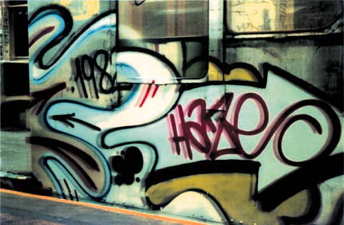
Eric Haze
Graffiti artist/Graphic Designer

One of the graffiti artists who did work for the game Jet Grind Radio (see earlier entry). Other graffiti artists are:-
Edge
Uecho
Enas
Higuchin
Chikpon
K-Chap
Extremely influential New York graffiti artist, created the graphic style associated with hiphop music when it began in the 8o's. He has worked for Public Enemy, LL Cool Jay the Beastie Boys, and MTV. His style of hand writing, visible on the cover of the Beastie Boys album "Check your Head" is often imitated, along with his style of drawing.
Like other artists in this blog, he has a unique style which others often try to immitate and which has won him alot of work. His drawing and handwriting styles 'evolved' through experimentation and trial & error - he started out as a graffiti artist in the New York subways.
As well as music, his graphic style has also influenced that of surfer and skater culture. He has produced special edition skate decks and shoes.
He is very popular in Japan. His Japanese site is http://www.haze.jp/
Friday, 11 May 2007
11/05/07
Reflection on drawing block
There were several parts to this block. I was more comfortable with some (e.g. collaging) than others (e.g. painting). I learned that one must experiment and try new things.
There were several parts to this block. I was more comfortable with some (e.g. collaging) than others (e.g. painting). I learned that one must experiment and try new things.
11/5/07
Reflection on printing block
In this brief we were to experiment with printing process and produce a peice of work based on our "prophets and poets" work.
I have taken a definate liking to screen printing. I think that in alot of instances it's easier and quicker to use a computer and an ink jet to produce a printed peice, but traditional printing does have it's uses - such as when printing on unusual materials. I used a mixture of printing methods for my work, and the look of my final work could not have been acheived on a computer. It also took alot of experimentation to come up with a look I was happy with.
11/5/07
Reflection on flash brief
finished peice visible here - http://www.newgrounds.com/portal/view/381305
In this brief we were to take a peice of our "prophets and poets" work (in my case Spike Milligan) and use it as a basis for a projest in Flash.
This was one of the briefs I felt more comfortable with and took to easily. Although I have tried using interactive software in the past, this is the first time I've seen an interactive peice through to completion. It's also the first time I have planned and storyboarded my work and spent this amount of time working on it (over a month).
I would definately like to work on Flash again and learn how to action-script.
Wednesday, 9 May 2007
09/05/07
 Eboy
EboyGerman graphic designers/illustrators
http://hello.eboy.com/eboy/index.php
- use pixel art - a technique mainly used for 80's and 90's 2D computer games
- have had several high-profile clients - adidas, honda and channel 4 to name but a few - all wanting their products to be 'cool' - which is difficult to do because the definition of being cool always changes
- they have become successful by developing their own extremely unique stlye - appears to be influenced by fashion, music, pop culture, and retro videogames
WHAT NEXT?
Have a go at pixel art myself - see http://flickr.com/photos/75102187@N00/sets/72157600113568391/
Monday, 23 April 2007
23/04/07
Jet Grind Radio (Game)
- Uses cel-shading to give 3D objects a cartoon look.
- Seems to be influenced by skating culture, graffitti, music, fashion, japanese pop culture. Very stylish, reminds me of the tone and style of eboy's work.
- Interesting how japan interpret western culture
- Menu screens/interface seem very well thought out and look as if they've been done by a proper designer, looks like they've made a font specially for the game. Even the loading screen looks good and suits the style of the game.
- Uses music to meld the segments of the game together. Also uses a DJ character to narrate the game and tell the player what to do.
What Next?
Find out who the artists and designers are who worked on the game
I have e-mailed Sega (9/5/07)
22/05/07
The chief graphic designers shown in the end credits are Ryuta Ueda and Kazuki Hosokawa. There work won them the Visual Arts Award at the 1st Annual Game Developers Choice Awards in 2001.
http://www.gamechoiceawards.com/archive/visualarts.htm
There are around 20 other graphic designers mentioned in the games credits.
25/05/07 - 9.30am
Sega of America have replied with the following info:-
Credits
Project Manager Craig Derrek
Lead Designer and Artist Rob Gallerani
Lead Programmer Eric Caraszi
Programmer Jan-Erik Steel
Artist/Animator Brent Gibson
Additional Programming Sunbir Gil
Additional Programming Brian Sox
Additional Art/Animation Travis Cameron
Additional Art/Animation Yin Zhang
It's now a matter of researching these artists and their work.
25/05/07 - 9.55am
After researching some of these names on the web, it appears that this is the team that worked on the Gameboy version of the game, not the original Dreamcast version that I was interested in. My mistake for not specifying that when I emailed Sega.
Tuesday, 20 March 2007
20/03/07
"POWER IN YOU" Billboards
Can be seen at http://struckcreative.com/work/p-i-y-billboards
Extremely simple idea that gets the point across.
Can be seen at http://struckcreative.com/work/p-i-y-billboards
Extremely simple idea that gets the point across.
Wednesday, 14 March 2007
14/03/07
ANIMATED TYPE VIDEO
From Youtube
The song is by Jimmy Buffet
Hope to be able to do stuff like this myself. Syncronized well with the music. Good mixture of text and image- could use the same technique for printed work. The colour and layout of the text puts across the tone of the song i.e it puts across a message without saying anything.

Monday, 12 March 2007
11/03/07
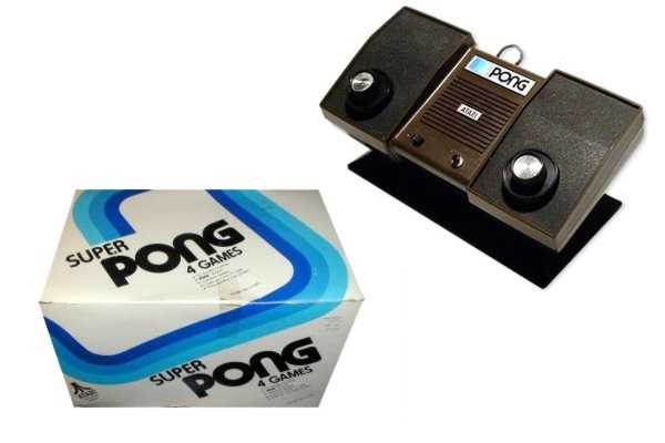
SUPER PONG PACKAGING
Found this whilst I was bored and on the internet. I think the design on the box is very clean and simple, and although it's from the 70's it wouldn't look out of place today. Makes good use of the 3D shape of the box.
Found it on thegameconsole.com
ABOUT PONG "In 1973, after the success of the original PONG coin-op, an Atari engineer by the name of Harold Lee came up with the idea of a home PONG unit. Since the PONG coin-op that Alan Alcorn designed was nothing more than the game board connected to an actual television set, he thought it would be possible to scale it down a bit and modify it for use at home. This would be a new direction for the fledgling Atari consumer electronics. If they could pull it off, they would be one of the pioneers of using high tech custom integrated circuits in the consumer industry.In 1975 it was decided Sears would sell PONG under it's own specially created Tele-Games label, and production was initially projected at 50,000 units. This was soon raised to 150,000 for the 1975 Christmass season. Atari agreed to give Sears exclusive rights for the following year, and would continue to make custom Tele-Games versions for any future consoles. This was the beginning of a long relationship between Atari and Sears, which would continue even after Nolan Bushnell sold Atari to Warner."
ABOUT SUPER PONG "Atari's sales of the Home PONG console were phenomenal to put it mildly. Atari would continue to cash in of the PONG franchise by releasing yet another home version of one of its arcade game assets. This time it would be Super PONG. Now home players could select for 4 different variations of PONG games to delight and entertain them for countless hours.Meanwhile numerous knock-off PONG-type consoles were hitting the market. However, because of Atari's now well known presence in the coin-op market, its name recognition helped it stand out. Also Atari's unusual Pedestal design helped Atari stand out in the Sears Retail Stores as well as other stores who were now carrying Atari products.When compared to the plethora of bland and boxy "Me-Too" consoles by so many other companies, the Atari PONG line of consoles simply stood out. Atari's consoles had eye catching rainbow colors and a deep and ear catching PONG sound from their built in speaker. Most other consoles were still far behind playing catch up with Black & White displays, flimsy controllers and some even without sound."
WHAT NEXT?
Find out who did the design
Subscribe to:
Comments (Atom)